MAKING A PORTFOLIO: The Creation of SkyeDoodle
Lots and lots and lots of new things... A lot has happened this past month—and over the last few months! I don't even know where to begin. I decided to create a portfolio after realizing that every developer seems to have one—everyone except me. So, I spent several days brainstorming how to approach it. Eventually, I realized that a highly professional and serious portfolio might not be the right fit for me. I checked out portfolios from artists and developers, and—I have to admit—I felt a little discouraged, thinking I'd never be able to create something like that.
Anyway, here we are! I finally have a small portfolio. It’s not perfect and still a work in progress, but it makes me happy, and I see it as a step forward. In this blog, I’ll be sharing my creative process because, honestly, at first, I had no idea how to design my portfolio! And if you’re in the same boat—creating your first one—you can probably imagine how absurdly complicated it is to settle on a design that truly reflects your style.
Startup
Breaking Down My Portfolio Layout!
I'm not an artist, and I don't consider myself one. I feel like being an artist something is bigger than most people realize, and I've always struggled to see myself that way. My older sister is an artist, and her work is amazing—but unlike her, I don't have that kind of artistic talent. So, how was I supposed to design something like this without any artistic skill?
Well, first, I realized I needed to focus on the basics: the website’s skeleton and structure. If you've read my CSS Grid post in Spanish, you'll know what I mean. Right now, I still struggle with making websites fully responsive on mobile—mostly because, if I'm being honest, I can be pretty lazy lolol.
Still, I decided to give it a shot so my friends could easily view my portfolio on their phones. I grabbed a pencil and paper and sketched out my first draft of the layout! And yes, if you're wondering, I went for a bit of a Needy Streamer Overload vibe—just with a more vanilla and friendly theme. I wanted to blend a bunch of different ideas, but I couldn't decide on a direction. Next thing I knew, it was three in the morning, and I was still sitting at my desk, frustrated beyond belief, wondering why I wasn't making any progress.
The Overall Structure :D
After struggling with the design for ages, I finally settled on something that felt just right—a mix of nostalgia, personal expression, and a touch of chaos (in a good way)! I wanted my portfolio to feel more like a cute digital space rather than a rigid, ultra-professional site. So, let’s break it down!
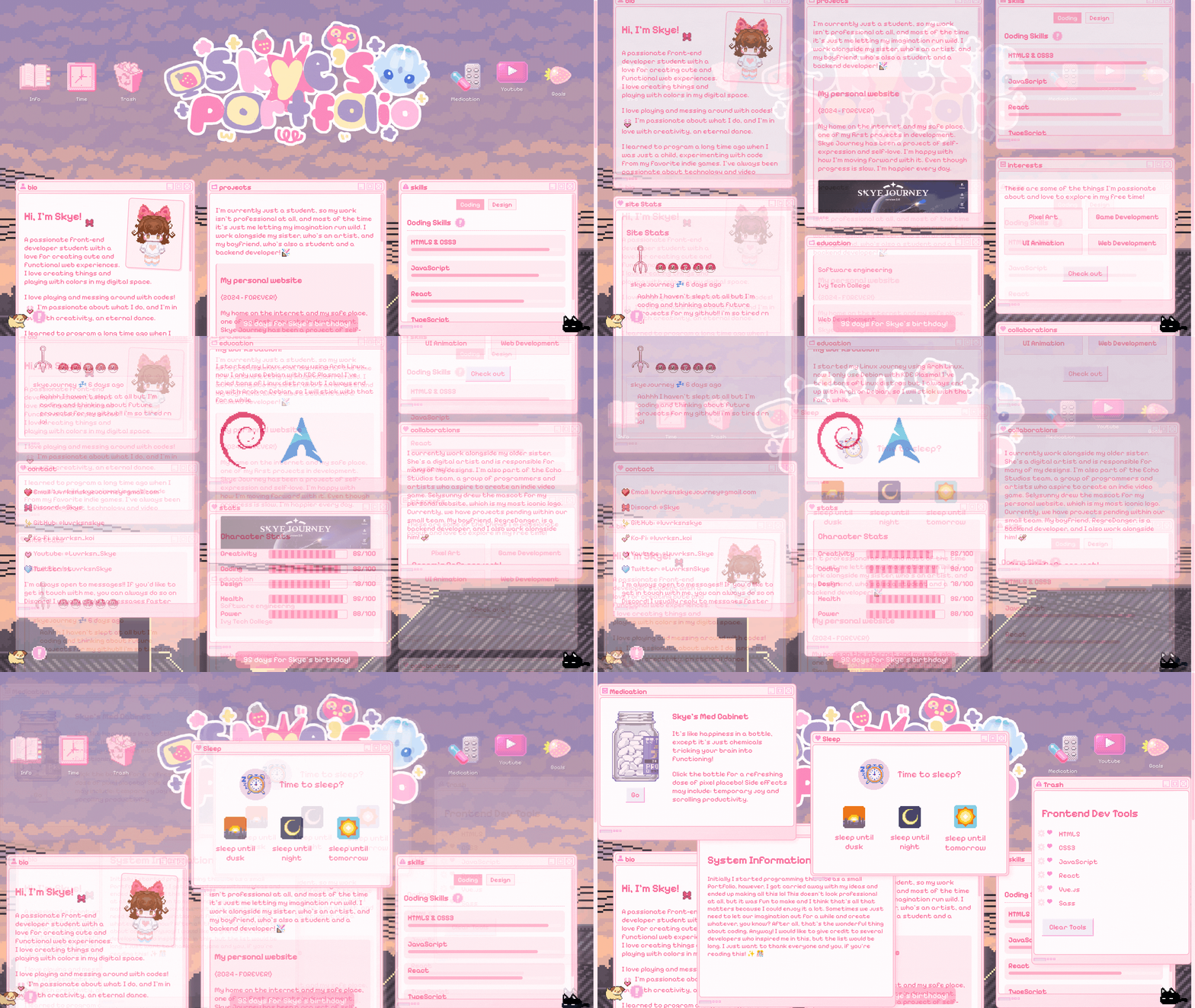
My portfolio is built with a three-column layout, inspired by old-school desktop interfaces. Each section is designed to feel like an interactive "window", making it playful and dynamic. The site has a header, three main columns, and some fun interactive elements scattered throughout!
At the very top, there’s a title banner ("Skye's Portfolio") with little desktop-style icons on both sides. These icons—like "Info," "Trash," and "Goals"—add a fun touch, almost like a retro operating system. It’s my way of making things feel cozy and familiar!
The Left Column
Features a pixel-art version of me (because pixel art is adorable). Includes personal details like my age, pronouns, languages, and fun facts about me! There’s even a "More About Me!" button for extra details.
I also have visitor stats and my status.cafe updates (so you can always see what I’m up to).
And of course, all the ways to reach me—Discord, GitHub, YouTube, and more! Encourages people to message me (I promise I reply… most of the time lol).
The Middle Column
Projects Window is the biggest section, where I showcase my personal projects with descriptions, images, and "View Project" buttons. Some projects are still WIP, but I’m really excited about them!
Education Window lists my college background, my favorite tools (VS Code, Figma, React, etc.), and even my Debian Linux workstation setup. Yes, I’m a Linux nerd, and I’m proud.
Also, instead of a boring skill list, I turned it into video game-like character stats (because why not?). Displays levels for Creativity, Coding, Design, Health, and Power!
The Right Column
Skills Window is divided into Coding and Design, with cute progress bars to show my expertise in things like JavaScript, React, UI/UX, and even Pixel Art.
Interests Window highlights my passions like Game Development, UI Animation, and Web Dev. Uses a grid-style layout to make it more fun and engaging!
Collaborations Window mentions people I work with—my sister (a talented artist), my boyfriend (a backend developer), etc. Features "Cream’s Cafe," a project where we designed a collection of adorable animated characters with my sis!
Fun Extras & Hidden Details
- Clicking on my "Mewo Sleep" GIF plays sound effects and spawns floating hearts.
- Buttons and icons have sound effects when clicked (because who doesn’t love a little auditory feedback?).
- A countdown at the bottom tracks the days until my birthday.
- A tiny puppy GIF acts as a music player —click it to start or stop the music!
Sketching
One of the most fun parts of making my portfolio was creating a pixel art version of myself! I wanted something that matched the cute, nostalgic, and slightly chaotic aesthetic of my website, but drawing myself in pixel art was definitely a challenge. Even though I don’t consider myself an artist, I still love experimenting with colors and shapes—so I took on the challenge of making a tiny, pixelated Skye! to this end, I primarily used Libresprite, a free and open source fork of the better known Aseprite. I’ve been meaning to make a more in-depth post about Libresprite as part of my FOSS recommendations. I used it to make my website image and found the experience overall very nice! That said, I’m pretty much a pixel art beginner, as it were.
Regarding the assets and sprites in the portfolio, the vast majority are from NSO. I just decided to slightly change their colors and tones to better fit my style. Nothing more.
Credits
Despite all this, I want to thank a couple of people who supported and inspired me in this endeavor. Lilithdev's website was a huge inspiration for me, and I definitely think it's worth checking out. I also want to thank my sister and my boyfriend! They both supported me in creating this. I'll leave the Lilith website button down below, so feel free to check it out!

Final Thoughts!
This portfolio is still a work in progress, but I’m really happy with how it’s shaping up. I wanted something that felt like me—a mix of cute, chaotic, and functional. It may not be the most "serious" developer portfolio out there, but that’s exactly the point!
If you’re struggling with your own portfolio, just remember: make something that makes you happy!

 Home
Home About
About Social
 Support
 Tos
Tos Tools
Tools Blog
Blog  Resources
 Software
 Credits
 Workstation
 Sitemap